This section is similar regardless of your model structure (e.g. error distribution assumption). The examples below all assume a normal error distribution assumption but you can use the process presented here for models of any structure.
1 Background
Here, you will visualize how each predictor is affecting the response by drawing how your modelled fitted values (the estimates of your response made by the model) change with your predictors, along with a measure of uncertainty around those fitted values. You also want to include your data (actual observations of your response and predictors) so you can start to communicate how well your model captures your hypothesis, and what amount of deviance in your response is explained by your model.
There are a lot of different R packages that make it easy to quickly visualize your model. We will focus on two methods that will allow you to make quick visualizations of your model and/or customize the figures as you would like.
visualizing using the visreg package: This will let you get a quick look at your model object with a limited amount of customization.
visualizing “by hand”: Here, “by hand” is a bit of a silly description as R will be doing the work for you. What I mean by “by hand” is that you will be building the plot yourself using your model object. This method is very flexible and will lead you to a fully customizable visualization. This process involves i) choosing the values of your predictors at which to make estimates of your fitted values, ii) using predict() to use your model to estimate your response variable at those values of your predictors, and iii) use the model estimates to plot your model fit.1
Below are visualizations for each of our examples. Two further tips:
In a few of the examples, we use ggplot2’s position_dodge argument. Be careful here - it can be useful for avoiding overlapping data points when predictors are categorical BUT can actually change the location of data points if used with a numeric predictor.
Note that we do not use the geom_smooth() function in the ggplot2 package. The fits provided by geom_smooth() are not the same as the model fits directly from your best-specified model so we avoid this here (e.g. geom_smooth() will fit a separate model for each level of your categorical predictor negating the hypothesis testing that allows us to make comparisons across the predictor levels).
2 Examples
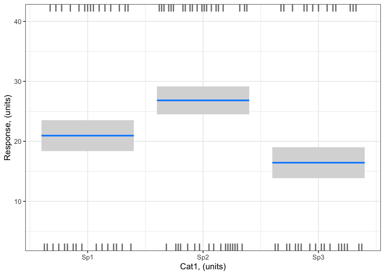
Example 1: Resp1 ~ Cat1 + 1
Example 1: Resp1 ~ Cat1 + 1
Visualizing with the visreg package
library (visreg) # load visreg package for visualizationlibrary(ggplot2) # load ggplot2 package for visualizationvisreg(bestMod1, # model to visualizescale ="response", # plot on the scale of the responsexvar ="Cat1", # predictor on x-axis#by = ..., # if you want to include a 2nd predictor plotted as colour#breaks = ..., # if you want to control how the colour predictor is plotted#cond = , # if you want to include a 3rd predictor#overlay = TRUE, # to plot as overlay or panels, when there is #rug = FALSE, # to turn off the rug. The rug shows you where you have positive (appearing on the top axis) and negative (appearing on the bottom axis) residualsgg =TRUE)+# to plot as a ggplot, with ggplot, you will have more control over the look of the plot.ylab("Response, (units)")+# change y-axis labelxlab("Cat1, (units)")+# change x-axis labeltheme_bw() # change ggplot theme
Note the small dashes at the top and bottom of the plot. This is called the “rug”. visreg uses the rug to give an indication of where your observed data lie - a dash on the bottom axis means you have a data point at that location that would be a negative residual relative to the model fit; a dash on the top axis means you have a data point at that location that would be a positive residual relative to the model fit. This is useful, but not the same as actually including your observations on the plot. Unfortunately due to limitations of the visreg package, you can not easily add you observations onto plots where the x-axis is a categorical predictor. But that is ok, because there are other options…
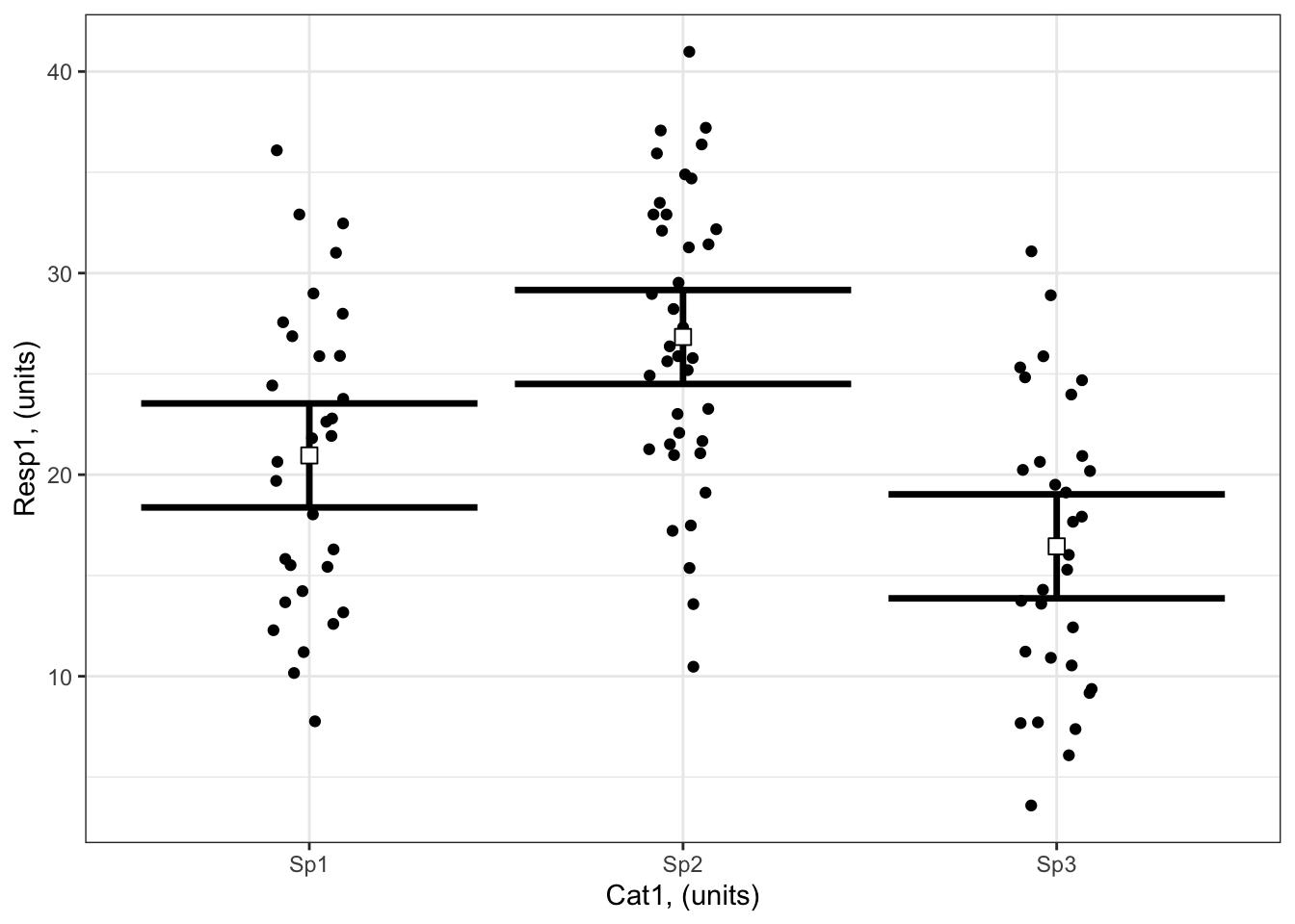
Visualizing by hand
To plot by hand, you will
first make a data frame containing the value of your predictors at which you want to plot effects on the response:
# Set up your predictors for the visualized fitforCat1<-unique(myDat1$Cat1) # every value of your categorical predictor# create a data frame with your predictorsforVis<-expand.grid(Cat1=forCat1) # expand.grid() function makes sure you have all combinations of predictors
Next, you will use the predict() function2 to get the model estimates of your response variable at those values of your predictors:
# Get your model fit estimates at each value of your predictorsmodFit<-predict(bestMod1, # the modelnewdata = forVis, # the predictor valuestype ="link", # here, make the predictions on the link scale and we'll translate the back belowse.fit =TRUE) # include uncertainty estimateilink <-family(bestMod1)$linkinv # get the conversion (inverse link) from the model to translate back to the response scaleforVis$Fit<-ilink(modFit$fit) # add your fit to the data frameforVis$Upper<-ilink(modFit$fit +1.96*modFit$se.fit) # add your uncertainty to the data frame, 95% confidence intervalsforVis$Lower<-ilink(modFit$fit -1.96*modFit$se.fit) # add your uncertainty to the data frame
Finally, you will use these model estimates to make your plot:
library(ggplot2)ggplot() +# start ggplotgeom_point(data = myDat1, # add observations to your plotmapping =aes(x = Cat1, y = Resp1), position=position_jitter(width=0.1)) +# control position of data points so they are easier to see on the plotgeom_errorbar(data = forVis, # add the uncertainty to your plotmapping =aes(x = Cat1, y = Fit, ymin = Lower, ymax = Upper),linewidth=1.2) +# control thickness of errorbar linegeom_point(data = forVis, # add the modelled fit to your plotmapping =aes(x = Cat1, y = Fit), shape =22, # shape of pointsize =3, # size of pointfill ="white", # fill colour for plotcol ='black') +# outline colour for plotylab("Resp1, (units)")+# change y-axis labelxlab("Cat1, (units)")+# change x-axis labeltheme_bw() # change ggplot theme
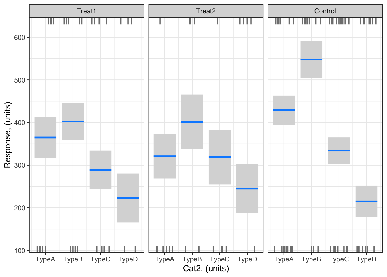
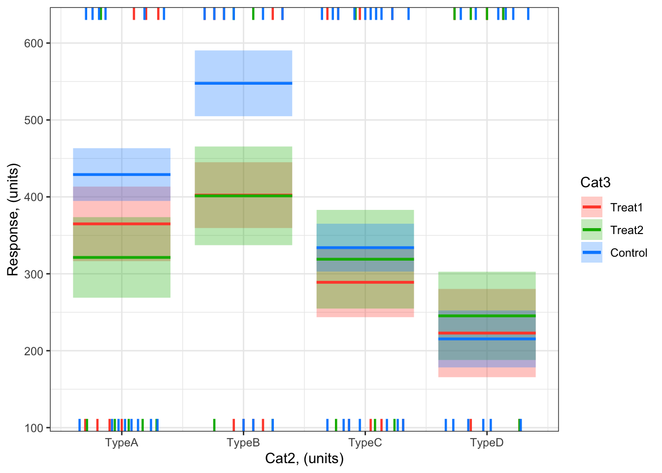
Example 2: Resp2 ~ Cat2 + Cat3 + Cat2:Cat3 + 1
Example 2: Resp2 ~ Cat2 + Cat3 + Cat2:Cat3 + 1
Visualizing with the visreg package
As you have more than one predictor in Example 2, there are a number of ways you can visualize your effects.
Here is an example of a visualization with Cat2 on the x-axis and the effects of Cat3 plotted as separate panels:
library (visreg) # load visreg package for visualizationlibrary(ggplot2) # load ggplot2 package for visualizationvisreg(bestMod2, # model to visualizescale ="response", # plot on the scale of the responsexvar ="Cat2", # predictor on x-axisby ="Cat3", # if you want to include a 2nd predictor plotted as colour#breaks = ..., # if you want to control how the colour predictor is plotted#cond = , # if you want to include a 3rd predictoroverlay =FALSE, # to plot as overlay or panels, when there is #rug = FALSE, # to turn off the rug. The rug shows you where you have positive (appearing on the top axis) and negative (appearing on the bottom axis) residualsgg =TRUE)+# to plot as a ggplot, with ggplot, you will have more control over the look of the plot.ylab("Response, (units)")+# change y-axis labelxlab("Cat2, (units)")+# change x-axis labeltheme_bw() # change ggplot theme
# tip: we can't include our observations on this plot due to the limitations of the visreg package when plotting with a categorical predictor on the x-axis
And here is an example of a visualization with Cat2 on the x-axis and the effects of Cat3 overlayed on the plot as different colours for each category (level) of Cat3:
visreg(bestMod2, # model to visualizescale ="response", # plot on the scale of the responsexvar ="Cat2", # predictor on x-axisby ="Cat3", # if you want to include a 2nd predictor plotted as colour#breaks = ..., # if you want to control how the colour predictor is plotted#cond = , # if you want to include a 3rd predictoroverlay =TRUE, # to plot as overlay or panels, when there is #rug = FALSE, # to turn off the rug. The rug shows you where you have positive (appearing on the top axis) and negative (appearing on the bottom axis) residualsgg =TRUE)+# to plot as a ggplot, with ggplot, you will have more control over the look of the plot.ylab("Response, (units)")+# change y-axis labelxlab("Cat2, (units)")+# change x-axis labeltheme_bw() # change ggplot theme
# tip: we can't include our observations on this plot due to the limitations of the visreg package when plotting with a categorical predictor on the x-axis
Note the small dashes at the top and bottom of the plot. This is called the “rug”. visreg uses the rug to give an indication of where your observed data lie - a dash on the bottom axis means you have a data point at that location that would be a negative residual relative to the model fit; a dash on the top axis means you have a data point at that location that would be a positive residual relative to the model fit. This is useful, but not the same as actually including your observations on the plot. Unfortunately due to limitations of the visreg package, you can not easily add you observations onto plots where the x-axis is a categorical predictor. But that is ok, because there are other options…
Visualizing by hand
#### i) choosing the values of your predictors at which to make a prediction# Set up your predictors for the visualized fitforCat2<-unique(myDat2$Cat2) # every level of your categorical predictorforCat3<-unique(myDat2$Cat3) # every level of your categorical predictor# create a data frame with your predictorsforVis<-expand.grid(Cat2 = forCat2, Cat3 = forCat3) # expand.grid() function makes sure you have all combinations of predictors#### ii) using `predict()` to use your model to estimate your response variable at those values of your predictor# Get your model fit estimates at each value of your predictorsmodFit<-predict(bestMod2, # the modelnewdata = forVis, # the predictor valuestype ="link", # here, make the predictions on the link scale and we'll translate the back belowse.fit =TRUE) # include uncertainty estimateilink <-family(bestMod2)$linkinv # get the conversion (inverse link) from the model to translate back to the response scaleforVis$Fit<-ilink(modFit$fit) # add your fit to the data frameforVis$Upper<-ilink(modFit$fit +1.96*modFit$se.fit) # add your uncertainty to the data frame, 95% confidence intervalsforVis$Lower<-ilink(modFit$fit -1.96*modFit$se.fit) # add your uncertainty to the data frame#### iii) use the model estimates to plot your model fitlibrary(ggplot2) # load ggplot2 libraryggplot() +# start ggplotgeom_point(data = myDat2, # add observations to your plotmapping =aes(x = Cat2, y = Resp2, col = Cat3), position=position_jitterdodge(jitter.width=0.75, dodge.width=0.75)) +# control position of data points so they are easier to see on the plotgeom_errorbar(data = forVis, # add the uncertainty to your plotmapping =aes(x = Cat2, y = Fit, ymin = Lower, ymax = Upper, col = Cat3),position=position_dodge(width=0.75), # control position of data points so they are easier to see on the plotsize=1.2) +# control thickness of errorbar linegeom_point(data = forVis, # add the modelled fit to your plotmapping =aes(x = Cat2, y = Fit, fill = Cat3), shape =22, # shape of pointsize=3, # size of pointcol ='black', # outline colour for pointposition=position_dodge(width=0.75)) +# control position of data points so they are easier to see on the plotylab("Resp2, (units)")+# change y-axis labelxlab("Cat2, (units)")+# change x-axis labellabs(fill="Cat3, (units)", col="Cat3, (units)") +# change legend titletheme_bw() # change ggplot theme
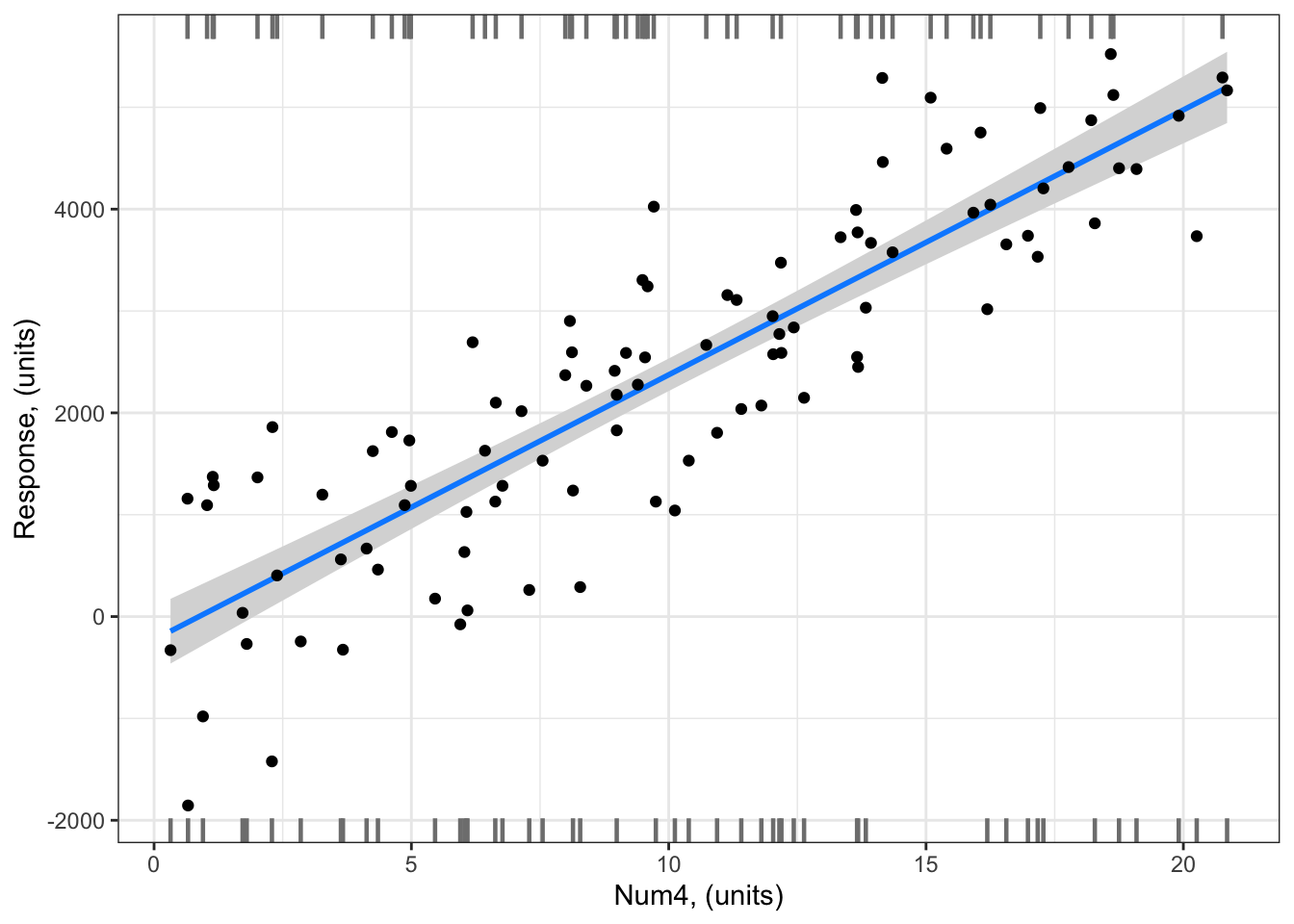
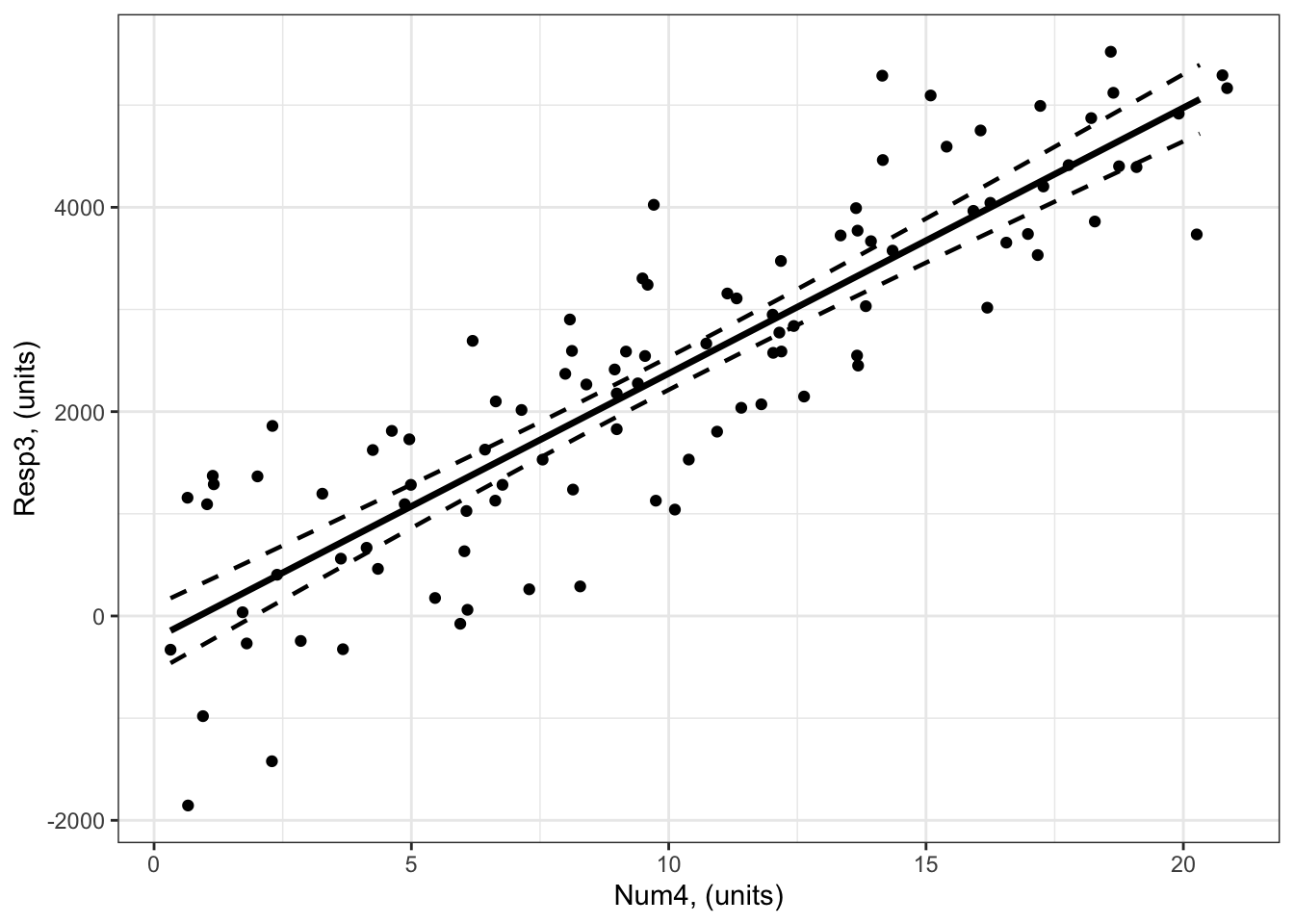
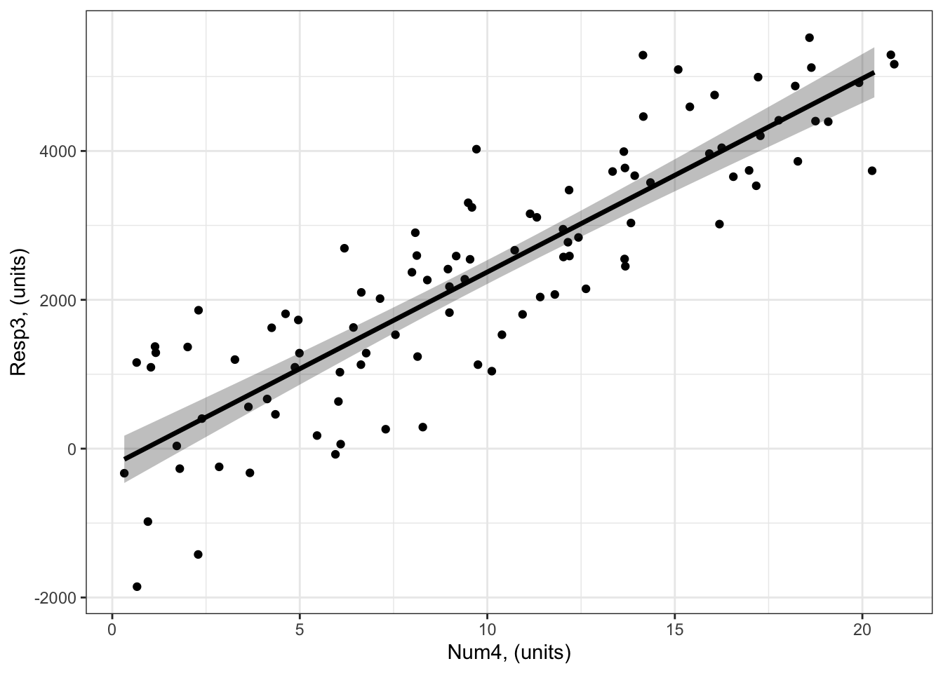
Example 3: Resp3 ~ Num4 + 1
Example 3: Resp3 ~ Num4 + 1
Visualizing with the visreg package
Notice how you can include the gg = TRUE argument to plot this as a ggplot type figure. This allows you to add your data onto the visualization of your model.
library (visreg) # load visreg package for visualizationlibrary(ggplot2) # load ggplot2 package for visualizationvisreg(bestMod3, # model to visualizescale ="response", # plot on the scale of the responsexvar ="Num4", # predictor on x-axis#by = ..., # if you want to include a 2nd predictor plotted as colour#breaks = ..., # if you want to control how the colour predictor is plotted#cond = , # if you want to include a 3rd predictor#overlay = TRUE, # to plot as overlay or panels, when there is #rug = FALSE, # to turn off the rug. The rug shows you where you have positive (appearing on the top axis) and negative (appearing on the bottom axis) residualsgg =TRUE)+# to plot as a ggplot, with ggplot, you will have more control over the look of the plot.geom_point(data = myDat3,mapping =aes(x = Num4, y = Resp3))+ylab("Response, (units)")+# change y-axis labelxlab("Num4, (units)")+# change x-axis labeltheme_bw() # change ggplot theme
# Note: you CAN include your observations on your plot with visreg when you have a numeric predictor on the x-axis
Note the small dashes at the top and bottom of the plot. This is called the “rug”. visreg uses the rug to give an indication of where your observed data lie - a dash on the bottom axis means you have a data point at that location that would be a negative residual relative to the model fit; a dash on the top axis means you have a data point at that location that would be a positive residual relative to the model fit.
Visualizing by hand
#### i) choosing the values of your predictors at which to make a prediction# Set up your predictors for the visualized fitforNum4<-seq(from =min(myDat3$Num4), to =max(myDat3$Num4), by =1)# a sequence of numbers in your numeric predictor range# create a data frame with your predictorsforVis<-expand.grid(Num4 = forNum4) # expand.grid() function makes sure you have all combinations of predictors. #### ii) using `predict()` to use your model to estimate your response variable at those values of your predictor# Get your model fit estimates at each value of your predictorsmodFit<-predict(bestMod3, # the modelnewdata = forVis, # the predictor valuestype ="link",# here, make the predictions on the link scale and we'll translate the back belowse.fit =TRUE) # include uncertainty estimateilink <-family(bestMod3)$linkinv # get the conversion (inverse link) from the model to translate back to the response scaleforVis$Fit<-ilink(modFit$fit) # add your fit to the data frameforVis$Upper<-ilink(modFit$fit +1.96*modFit$se.fit) # add your uncertainty to the data frame, 95% confidence intervalsforVis$Lower<-ilink(modFit$fit -1.96*modFit$se.fit) # add your uncertainty to the data frame#### iii) use the model estimates to plot your model fitlibrary(ggplot2) # load ggplot2 libraryggplot() +# start ggplotgeom_point(data = myDat3, # add observations to your plotmapping =aes(x = Num4, y = Resp3)) +# control position of data points so they are easier to see on the plotgeom_line(data = forVis, # add the modelled fit to your plotmapping =aes(x = Num4, y = Fit),linewidth =1.2) +# control thickness of linegeom_line(data = forVis, # add uncertainty to your plot (upper line)mapping =aes(x = Num4, y = Upper),linewidth =0.8, # control thickness of linelinetype =2) +# control style of linegeom_line(data = forVis, # add uncertainty to your plot (lower line)mapping =aes(x = Num4, y = Lower),linewidth =0.8, # control thickness of linelinetype =2) +# control style of lineylab("Resp3, (units)") +# change y-axis labelxlab("Num4, (units)") +# change x-axis labeltheme_bw() # change ggplot theme
# another option making use of geom_ribbon()ggplot() +# start ggplotgeom_point(data = myDat3, # add observations to your plotmapping =aes(x = Num4, y = Resp3)) +# control position of data points so they are easier to see on the plotgeom_ribbon(data = forVis, # add uncertainty to your plot (upper line)mapping =aes(x = Num4, ymin = Lower, ymax = Upper),alpha =0.3) +# control the transparency, between 0 (transparent) and 1 (opaque)geom_line(data = forVis, # add the modelled fit to your plotmapping =aes(x = Num4, y = Fit),linewidth =1.2) +# control thickness of lineylab("Resp3, (units)") +# change y-axis labelxlab("Num4, (units)") +# change x-axis labeltheme_bw() # change ggplot theme
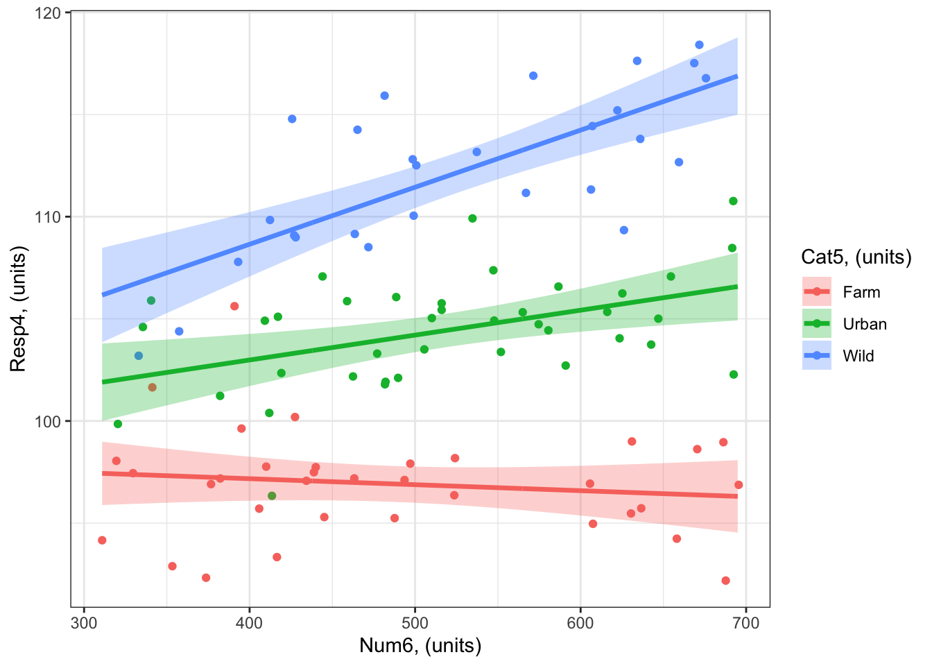
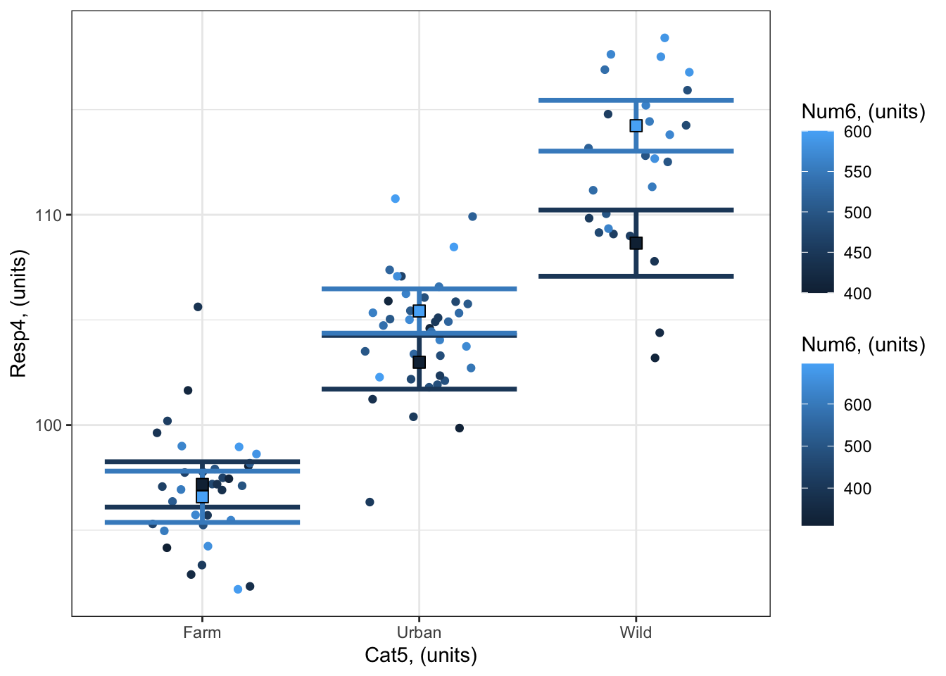
Example 4: Resp4 ~ Cat5 + Num6 + Cat5:Num6 + 1
Example 4: Resp4 ~ Cat5 + Num6 + Cat5:Num6 + 1
plotting with marginal effects can be 4 D with x-axis, colour, row and columns Visualizing with the visreg package
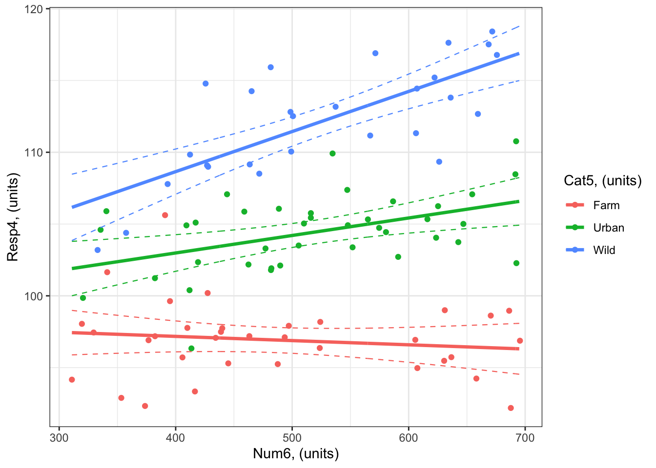
As you will see in (sec_quantifying?), there is no evidence of an effect of Num6 on Resp3 when Cat5 = Farm - i.e. the coefficient (slope) is not different from zero. In such cases, you would typically not include the effect on the plot (red line in the next figure), but I include it here to illustrate the visualization techniques.
A plot with Num6 on the x-axis:
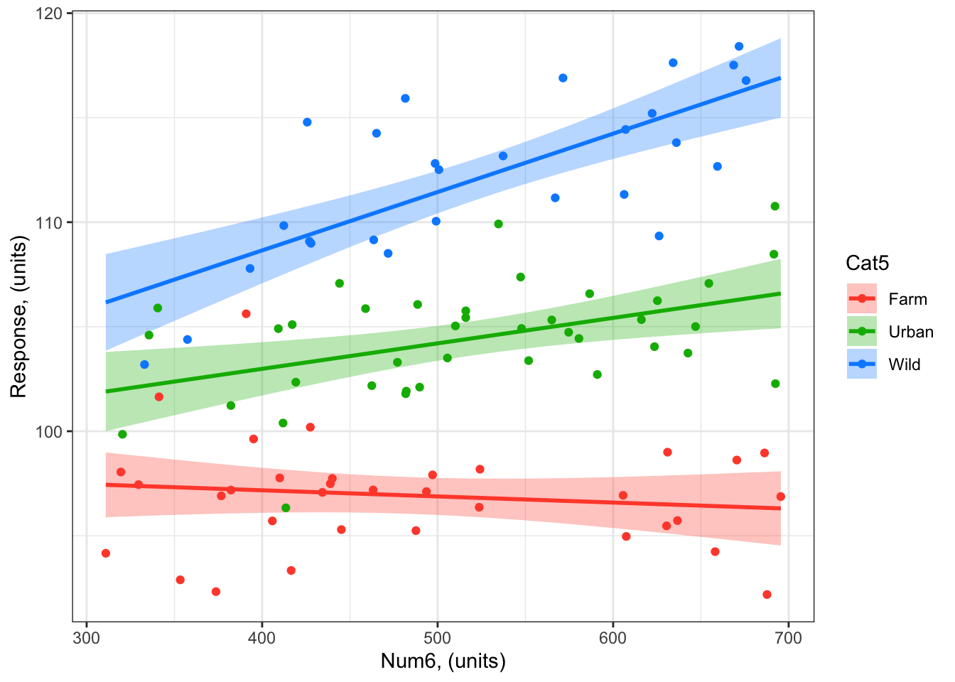
library (visreg) # load visreg package for visualizationlibrary(ggplot2) # load ggplot2 package for visualizationvisreg(bestMod4, # model to visualizescale ="response", # plot on the scale of the responsexvar ="Num6", # predictor on x-axisby ="Cat5", # predictor plotted as colour#breaks = 3, # if you want to control how the colour predictor is plotted#cond = , # if you want to include a 4th predictoroverlay =TRUE, # to plot as overlay or panels rug =FALSE, # to include a ruggg =TRUE)+# to plot as a ggplotgeom_point(data = myDat4, # datamapping =aes(x = Num6, y = Resp4, col = Cat5))+# add data to your plot#ylim(0, 60)+ # adjust the y-axis unitsylab("Response, (units)")+# change y-axis labelxlab("Num6, (units)")+# change x-axis labeltheme_bw() # change ggplot theme
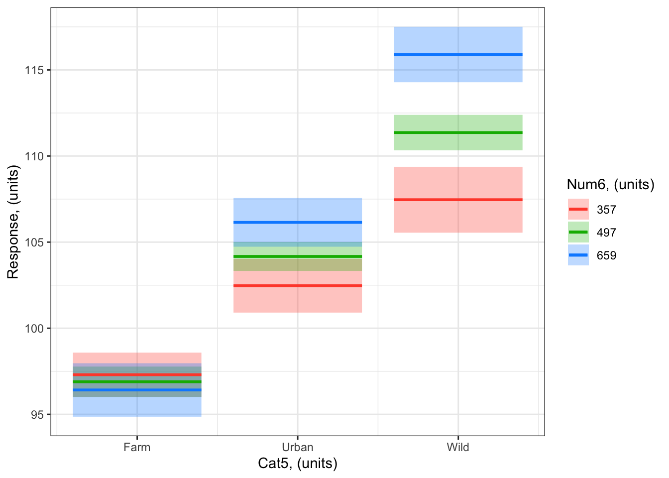
A plot with Cat5 on the x-axis: Notice how the numeric predictor is represented by different levels in the colours on the plot. Here you’ve asked for three levels with breaks = 3. Note that you can not include your observations on the visreg plot when the x-axis predictor is a category
visreg(bestMod4, # model to visualizescale ="response", # plot on the scale of the responsexvar ="Cat5", # predictor on x-axisby ="Num6", # predictor plotted as colourbreaks =3, # if you want to control how the colour predictor is plotted#cond = , # if you want to include a 4th predictoroverlay =TRUE, # to plot as overlay or panels rug =FALSE, # to include a ruggg =TRUE)+# to plot as a ggplotylab("Response, (units)")+# change y-axis labelxlab("Cat5, (units)")+# change x-axis labellabs(fill="Num6, (units)", col="Num6, (units)") +# change legend titletheme_bw() # change ggplot theme
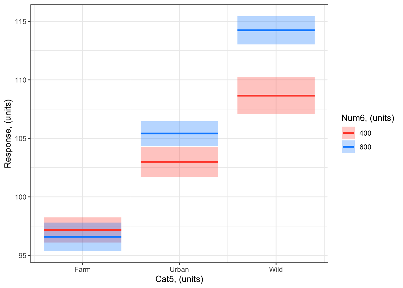
You can also specify at which levels the breaks should occur with the breaks = ... argument. For example, you can ask visreg to plot the modelled effects when Num6 = 400 and Num6 = 600:
visreg(bestMod4, # model to visualizescale ="response", # plot on the scale of the responsexvar ="Cat5", # predictor on x-axisby ="Num6", # predictor plotted as colourbreaks =c(400,600), # if you want to control how the colour predictor is plotted#cond = , # if you want to include a 4th predictoroverlay =TRUE, # to plot as overlay or panels rug =FALSE, # to include a ruggg =TRUE)+# to plot as a ggplotylab("Response, (units)")+# change y-axis labelxlab("Cat5, (units)")+# change x-axis labellabs(fill="Num6, (units)", col="Num6, (units)") +# change legend titletheme_bw() # change ggplot theme
Note that you can not include your observations on the visreg plot when the x-axis predictor is a category.
Visualizing by hand
Here’s an example with Num6 on the x-axis:
#### i) choosing the values of your predictors at which to make a prediction# Set up your predictors for the visualized fitforCat5<-unique(myDat4$Cat5) # all levels of your categorical predictorforNum6<-seq(from =min(myDat4$Num6), to =max(myDat4$Num6), by =1)# a sequence of numbers in your numeric predictor range# create a data frame with your predictorsforVis<-expand.grid(Cat5 = forCat5, Num6 = forNum6) # expand.grid() function makes sure you have all combinations of predictors. #### ii) using `predict()` to use your model to estimate your response variable at those values of your predictor# Get your model fit estimates at each value of your predictorsmodFit<-predict(bestMod4, # the modelnewdata = forVis, # the predictor valuestype ="link",# here, make the predictions on the link scale and we'll translate the back belowse.fit =TRUE) # include uncertainty estimateilink <-family(bestMod4)$linkinv # get the conversion (inverse link) from the model to translate back to the response scaleforVis$Fit<-ilink(modFit$fit) # add your fit to the data frameforVis$Upper<-ilink(modFit$fit +1.96*modFit$se.fit) # add your uncertainty to the data frame, 95% confidence intervalsforVis$Lower<-ilink(modFit$fit -1.96*modFit$se.fit) # add your uncertainty to the data frame#### iii) use the model estimates to plot your model fitlibrary(ggplot2) # load ggplot2 libraryggplot() +# start ggplotgeom_point(data = myDat4, # add observations to your plotmapping =aes(x = Num6, y = Resp4, col = Cat5)) +# control position of data points so they are easier to see on the plotgeom_line(data = forVis, # add the modelled fit to your plotmapping =aes(x = Num6, y = Fit, col = Cat5),linewidth =1.2) +# control thickness of linegeom_line(data = forVis, # add uncertainty to your plot (upper line)mapping =aes(x = Num6, y = Upper, col = Cat5),linewidth =0.4, # control thickness of linelinetype =2) +# control style of linegeom_line(data = forVis, # add uncertainty to your plot (lower line)mapping =aes(x = Num6, y = Lower, col = Cat5),linewidth =0.4, # control thickness of linelinetype =2) +# control style of lineylab("Resp4, (units)") +# change y-axis labelxlab("Num6, (units)") +# change x-axis labellabs(fill="Cat5, (units)", col="Cat5, (units)") +# change legend titletheme_bw() # change ggplot theme
# another option making use of geom_ribbon()ggplot() +# start ggplotgeom_point(data = myDat4, # add observations to your plotmapping =aes(x = Num6, y = Resp4, col = Cat5)) +# control position of data points so they are easier to see on the plotgeom_ribbon(data = forVis, # add uncertainty to your plot (upper line)mapping =aes(x = Num6, ymin = Lower, ymax = Upper, fill = Cat5),alpha =0.3) +# control the transparency, between 0 (transparent) and 1 (opaque)geom_line(data = forVis, # add the modelled fit to your plotmapping =aes(x = Num6, y = Fit, col = Cat5),linewidth =1.2) +# control thickness of lineylab("Resp4, (units)") +# change y-axis labelxlab("Num6, (units)") +# change x-axis labellabs(fill="Cat5, (units)", col="Cat5, (units)") +# change legend titletheme_bw() # change ggplot theme
Here’s an example with Cat5 on the x-axis:
#### i) choosing the values of your predictors at which to make a prediction# Set up your predictors for the visualized fitforCat5<-unique(myDat4$Cat5) # all levels of your categorical predictorforNum6<-c(400, 600) # a sequence of numbers in your numeric predictor range# create a data frame with your predictorsforVis<-expand.grid(Cat5 = forCat5, Num6 = forNum6) # expand.grid() function makes sure you have all combinations of predictors. #### ii) using `predict()` to use your model to estimate your response variable at those values of your predictor# Get your model fit estimates at each value of your predictorsmodFit<-predict(bestMod4, # the modelnewdata = forVis, # the predictor valuestype ="link", # here, make the predictions on the link scale and we'll translate the back belowse.fit =TRUE) # include uncertainty estimateilink <-family(bestMod4)$linkinv # get the conversion (inverse link) from the model to translate back to the response scaleforVis$Fit<-ilink(modFit$fit) # add your fit to the data frameforVis$Upper<-ilink(modFit$fit +1.96*modFit$se.fit) # add your uncertainty to the data frame, 95% confidence intervalsforVis$Lower<-ilink(modFit$fit -1.96*modFit$se.fit) # add your uncertainty to the data frame#### iii) use the model estimates to plot your model fitlibrary(ggplot2) # load ggplot2 libraryggplot() +# start ggplotgeom_point(data = myDat4, # add observations to your plotmapping =aes(x = Cat5, y = Resp4, col = Num6), position=position_jitterdodge(jitter.width=0.75, dodge.width=0.75)) +# control position of data points so they are easier to see on the plotgeom_errorbar(data = forVis, # add the uncertainty to your plotmapping =aes(x = Cat5, y = Fit, ymin = Lower, ymax = Upper, col = Num6),position=position_dodge(width=0.75), # control position of data points so they are easier to see on the plotsize=1.2) +# control thickness of errorbar linegeom_point(data = forVis, # add the modelled fit to your plotmapping =aes(x = Cat5, y = Fit, fill = Num6), shape =22, # shape of pointsize=3, # size of pointcol ='black', # outline colour for pointposition=position_dodge(width=0.75)) +# control position of data points so they are easier to see on the plotylab("Resp4, (units)")+# change y-axis labelxlab("Cat5, (units)")+# change x-axis labellabs(fill="Num6, (units)", col="Num6, (units)") +# change legend titletheme_bw() # change ggplot theme
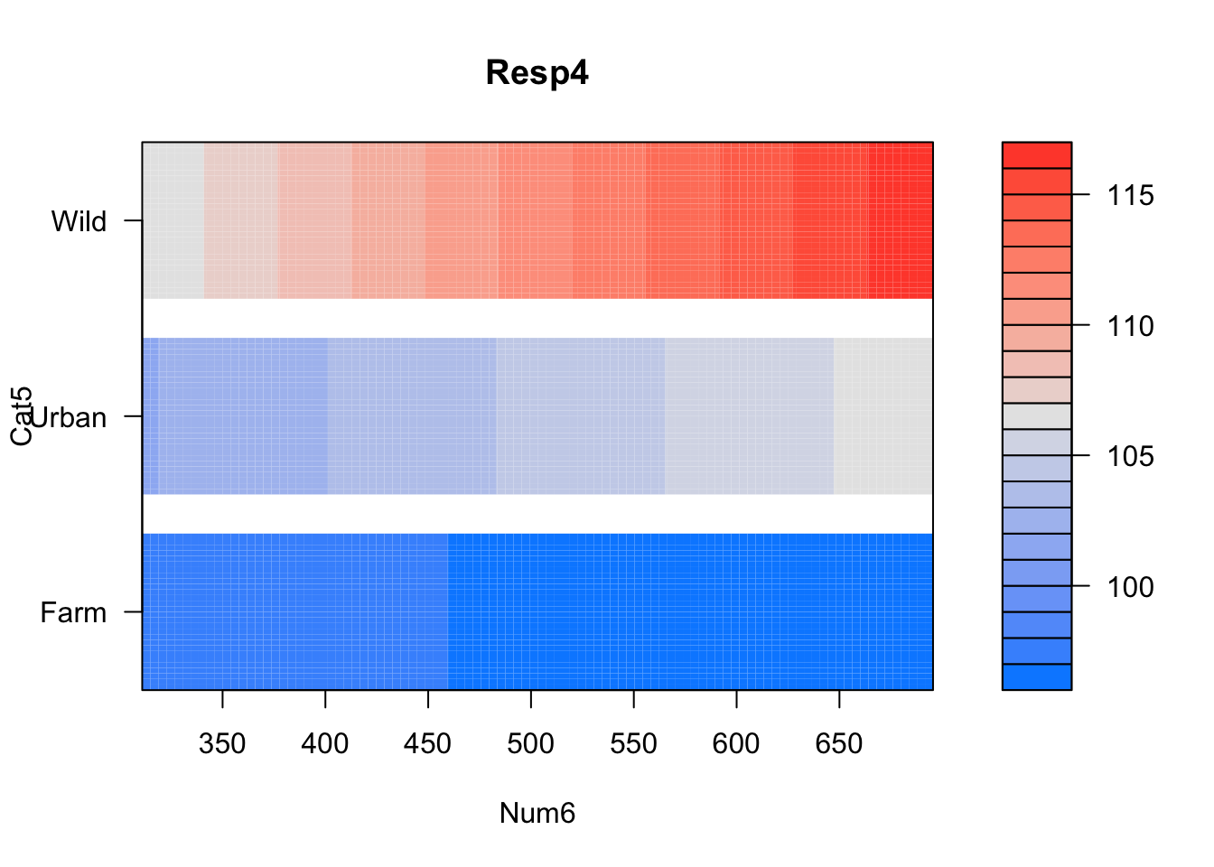
Aside: Plotting in 3D
You might notice that many of the plots above are communicating 3-dimensions (one response + two predictors) in a 2-dimensional plot. There are other ways of making 3-dimensional plots in R, e.g. with the visreg package using the visreg2d() function in the visreg package:
visreg2d(fit = bestMod4, # your modelxvar ="Num6", # what to plot on the x-axisyvar ="Cat5", # what to plot on the y-axisscale ="response") # make sure fitted values (colours) are on the scale of the response
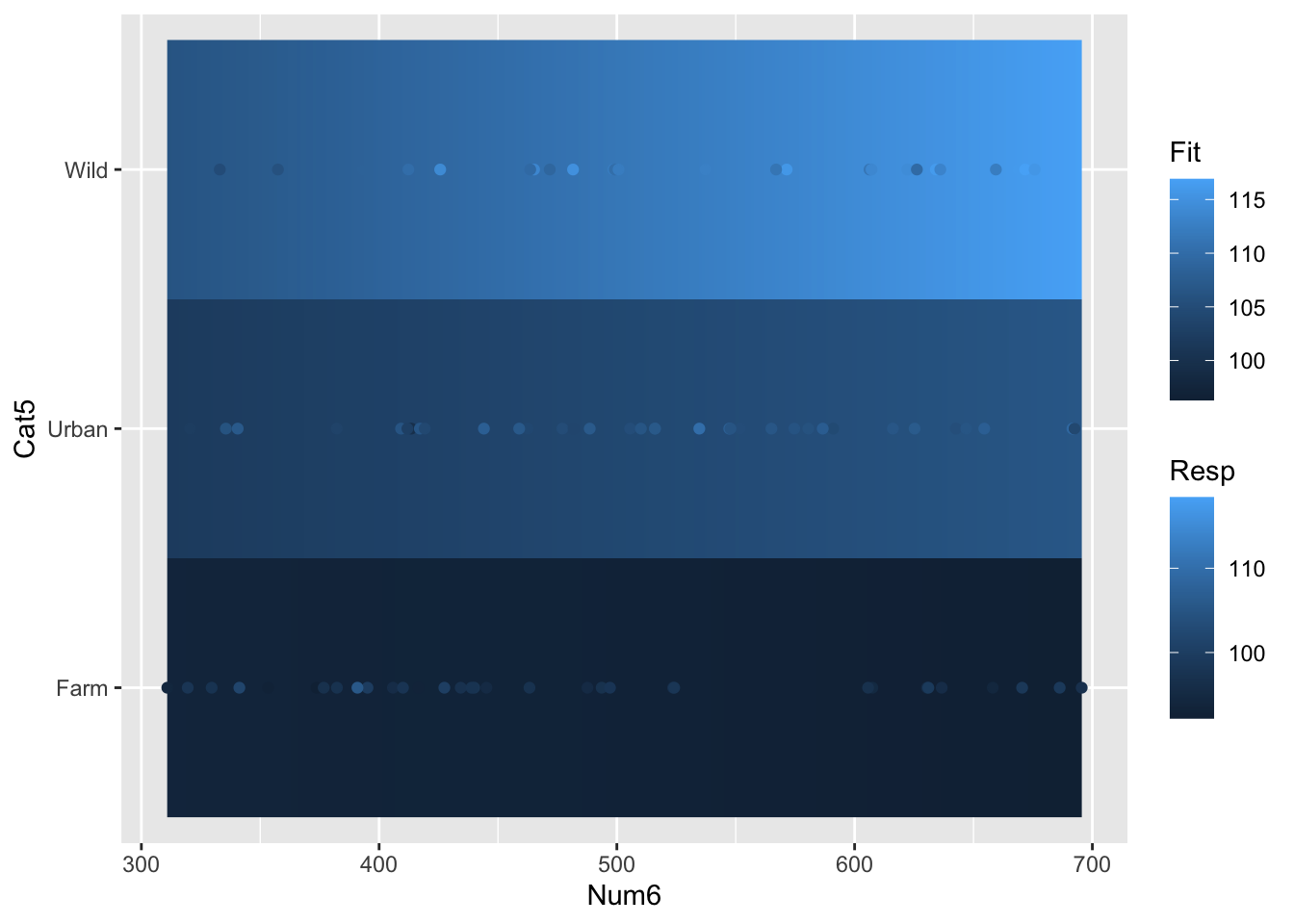
or “by hand” using the geom_raster() function in the ggplot2 package:
# Set up your predictors for the visualized fitforNum6<-seq(from =min(myDat4$Num6), to =max(myDat4$Num6), by =0.1) # e.g. a sequence of Cont valuesforCat5<-unique(myDat4$Cat5) # every value of your categorical predictor# create a data frame with your predictorsforVis<-expand.grid(Num6=forNum6, Cat5=forCat5) # expand.grid() function makes sure you have all combinations of predictors# Get your model fit estimates at each value of your predictorsmodFit<-predict(bestMod4, # the modelnewdata = forVis, # the predictor valuestype ="link", # here, make the predictions on the link scale and we'll translate the back belowse.fit =TRUE) # include uncertainty estimateilink <-family(bestMod4)$linkinv # get the conversion (inverse link) from the model to translate back to the response scaleforVis$Fit<-ilink(modFit$fit) # add your fit to the data frameforVis$Upper<-ilink(modFit$fit +1.96*modFit$se.fit) # add your uncertainty to the data frame, 95% confidence intervalsforVis$Lower<-ilink(modFit$fit -1.96*modFit$se.fit) # add your uncertainty to the data frame# create your plotggplot() +# start your ggplotgeom_raster(data = forVis, aes(x = Num6, y = Cat5, fill = Fit))+# add the 3 dimensions as a rastergeom_point(data = myDat4, aes(x = Num6, y = Cat5, colour = Resp)) # add your data
EXTRA: As you can see, these plots represent the 3rd dimension by using colour. You can also make actual 3 dimensional plots in R with the plotly package. These plots are interactive which makes them more useful than static 3d plots. Click on the plot and move your mouse to rotate the plot!
library(plotly) # load the plotly packageplot_ly(data = forVis, # the data with your model predictions (made above)x =~Num6, # what to plot on the x axisy =~Cat5, # what to plot on the y axisz =~Fit, # what to plot on the z axistype="scatter3d", # type of plotmode="markers") %>%# type of plotadd_markers(data = myDat4, x =~Num6, y =~Cat5, z =~Resp4) # add your data